- Kitchen, Renovations
10 Benjamin Moore Paint Colors That Make Your Kitchen Look Expensive
- By matin@quayconstruction.ca
Table of Contents
Color selection is one of the most powerful design decisions in any kitchen renovation.
The right palette can instantly elevate a space, making it feel more refined, cohesive, and high-end.
The most effective Benjamin Moore kitchen paint colors are not necessarily bold or trendy. Instead, they create subtle depth, complement materials, and enhance how light interacts with the space.
For homeowners planning a kitchen renovation Vancouver, paint selection should be considered early in the design phase to ensure it aligns with cabinetry, countertops, and overall layout.
Many homeowners begin by reviewing kitchen renovation Vancouver project planning guidance to understand how color decisions integrate with materials and finishes.
What Makes a Kitchen Look Expensive?
An expensive-looking kitchen is not defined by cost alone. It is defined by balance, material coordination, and visual consistency.
High-end kitchens often use controlled color palettes, typically built around neutral tones that allow cabinetry, stone surfaces, and lighting to stand out.
Paint colors play a supporting role. They should enhance the space without overwhelming it.
In Vancouver homes, especially in areas like Kitsilano and Downtown, luxury kitchens often rely on subtle contrasts, layered neutrals, and finishes that feel cohesive rather than overly designed.
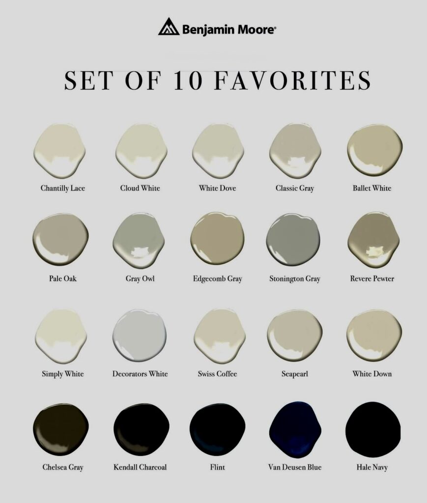
10 Benjamin Moore Paint Colors That Elevate Kitchen Design
The following paint colors are commonly used in high-end kitchen renovations because they create depth, reflect light effectively, and pair well with premium materials.
Color | Tone | Best Use |
|---|---|---|
White Dove OC-17 | Warm white | Cabinets, walls |
Simply White OC-117 | Clean white | Trim, ceilings |
Chantilly Lace OC-65 | Crisp white | Modern kitchens |
Classic Gray OC-23 | Soft off-white | Walls, open layouts |
Revere Pewter HC-172 | Warm greige | Transitional kitchens |
Edgecomb Gray HC-173 | Light greige | Full-home palettes |
Pale Oak OC-20 | Warm neutral | Walls, soft contrast |
Kendall Charcoal HC-166 | Deep gray | Accent walls, islands |
Hale Navy HC-154 | Rich navy | Islands, cabinetry |
Chelsea Gray HC-168 | Mid-tone gray | Balanced contrast |
These colors are widely used because they provide versatility and perform well across different lighting conditions and material combinations.
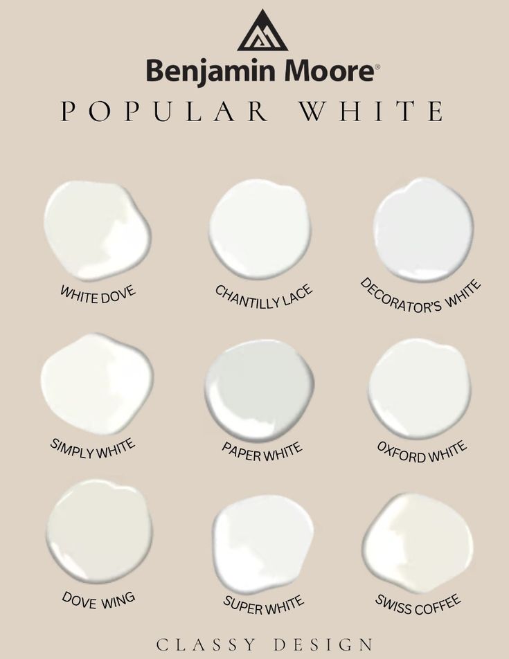
White Tones That Create a Luxury Look
White paint remains one of the most effective ways to create a high-end kitchen aesthetic.
Warm whites such as White Dove and Simply White soften natural light and prevent the space from feeling too stark or clinical.
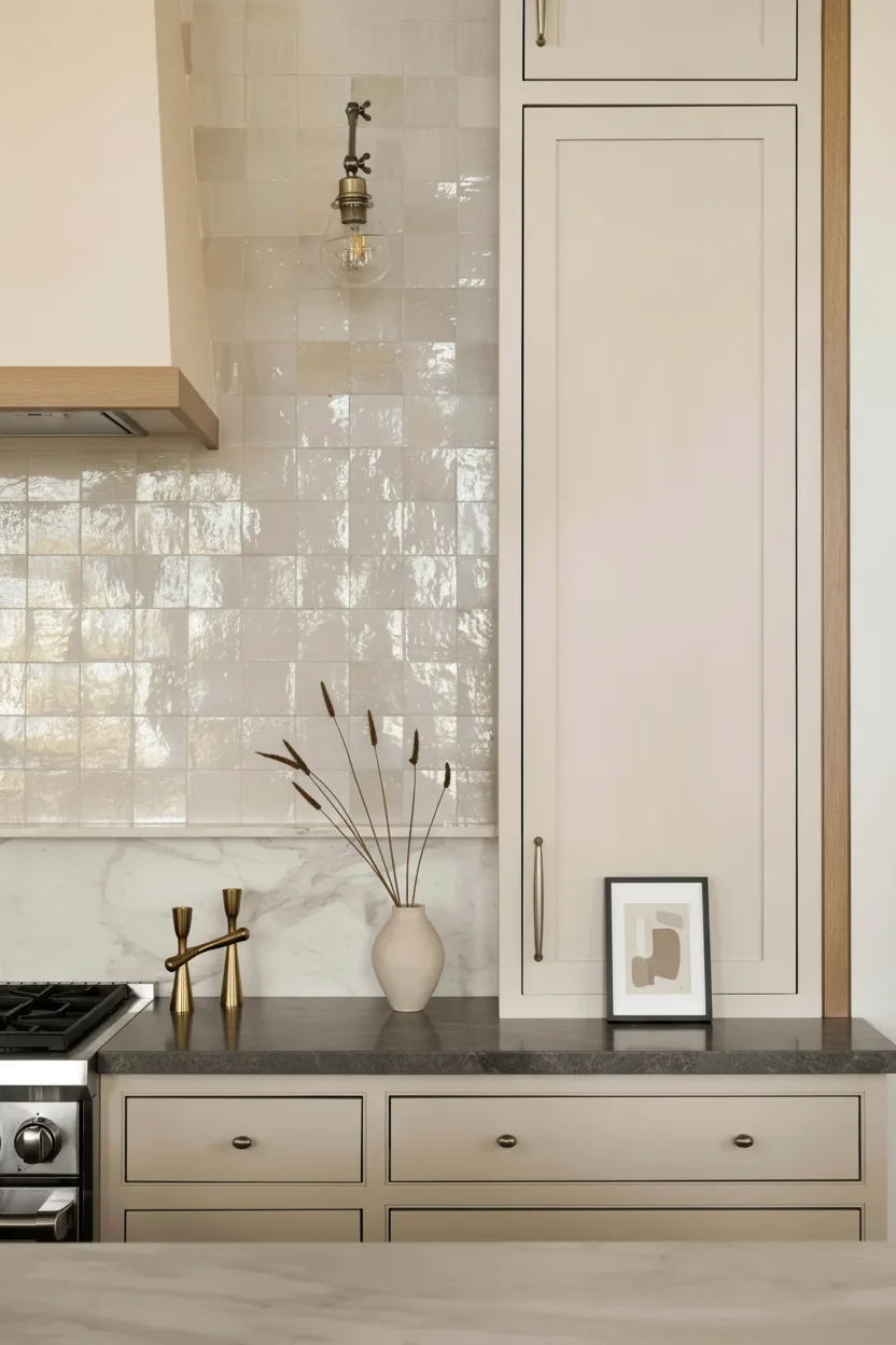
These tones work particularly well with quartz countertops, light wood flooring, and brushed brass hardware, creating a balanced and refined look.
In many Vancouver kitchen renovations, warm whites are used to create a clean backdrop that enhances the overall material palette without overpowering it.
Greige and Neutral Colors for Depth
Greige tones have become essential in modern kitchen design because they create subtle depth without overwhelming the space.
Colors like Revere Pewter and Edgecomb Gray help bridge the gap between warm and cool materials, making them highly versatile.
These tones are especially effective in open-concept layouts where the kitchen connects directly to living and dining areas.
They maintain visual continuity across spaces while adding a layer of sophistication to the overall design.
Dark Accent Colors That Add Contrast
High-end kitchens often incorporate darker tones to create contrast and visual interest.
Colors such as Hale Navy and Kendall Charcoal are commonly used on kitchen islands or feature walls to anchor the space.
These deeper tones create a strong focal point while still maintaining balance within the overall palette.
When paired with lighter cabinetry and stone surfaces, dark accents can significantly elevate the perceived quality and depth of the kitchen.
How Paint Colors Interact With Materials
Paint colors should never be selected in isolation.
Cabinet finishes, countertop materials, backsplash selections, and flooring all influence how a color appears once installed.
For example, a warm white may appear neutral when paired with wood tones but slightly yellow when combined with cooler gray finishes.
This is why color selection should always be coordinated with the full material palette to ensure a cohesive and well-balanced result.
Lighting and Color Perception in Vancouver Homes
Lighting plays a critical role in how paint colors are perceived within a kitchen.
In Vancouver, natural light tends to be softer and cooler, especially during the winter months. This can cause certain colors to appear more muted or slightly gray.
Artificial lighting also influences how colors are experienced. Warm LED lighting can soften tones and create a more inviting feel, while cooler lighting can make colors appear sharper and more contrast-heavy.
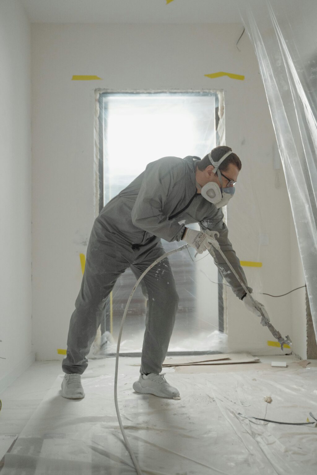
Testing paint samples in real lighting conditions is essential before finalizing any color decision.
How to Choose the Right Paint for Your Kitchen Renovation
Choosing the right paint color requires a combination of design understanding and practical planning.
Homeowners should evaluate how the color interacts with cabinetry, lighting, and flooring before making a final selection.
Many homeowners planning a renovation review kitchen renovation Vancouver project planning guidance to ensure that paint choices align with the overall design strategy.
Selecting paint early in the process helps avoid mismatched finishes and ensures a more cohesive final result.
Common Mistakes That Make Kitchens Look Cheap
Even high-end materials can appear less refined if paint colors are poorly chosen.
One common mistake is using overly bright or cool whites that create harsh contrast within the space.
Another mistake is combining too many colors, which can make the kitchen feel visually cluttered and less cohesive.
Ignoring undertones can also result in finishes that do not work well together.
A controlled, well-coordinated palette is essential for achieving a high-end look.
Why Paint Color Influences Property Value
Kitchen appearance plays a major role in how buyers perceive a home.
Neutral, well-designed kitchens tend to attract more interest and create stronger first impressions.
Paint colors that feel timeless and cohesive help position the property as move-in ready.
In Vancouver’s competitive real estate market, these details can influence both buyer interest and final sale price.
Final Thoughts on Luxury Kitchen Paint Colors
The best Benjamin Moore kitchen paint colors are those that enhance the overall design without drawing unnecessary attention.
Warm whites, balanced neutrals, and strategic dark accents are key elements in creating a high-end kitchen.
When paint is selected as part of a broader design strategy, it helps unify the space and elevate the overall quality of the renovation.
A well-chosen color palette ensures that the kitchen remains timeless, functional, and visually refined for years to come.
Frequently Asked Questions
What paint color makes a kitchen look expensive?
Neutral tones such as warm whites, greiges, and soft grays tend to create the most high-end appearance.
Should kitchen cabinets be lighter or darker than walls?
In most cases, cabinets are slightly darker or contrasted to create depth while maintaining balance.
Are dark kitchen colors a good idea?
Yes, when used strategically on islands or accents, dark colors can add contrast and sophistication.
Do white kitchens still increase home value?
Yes, white and neutral kitchens remain highly desirable because they appeal to a wide range of buyers.
How do I choose the best kitchen paint color?
Consider lighting, materials, and layout, and always test samples before making a final decision.