- Kitchen
Transform Your Kitchen with the Perfect Color Palette
- By matin@quayconstruction.ca
Table of Contents
Introduction: The Power of Color in Kitchen Design
Color is one of the most powerful tools in kitchen design, capable of transforming a space, evoking emotions, and creating a specific ambiance. Whether you’re renovating your kitchen or simply refreshing its look, choosing the right color palette can make a significant difference in both functionality and aesthetic appeal. From setting the mood to reflecting personal style, the importance of color in kitchen design cannot be overstated. In this guide, we’ll explore how to harness the power of color to create a kitchen that’s both beautiful and practical.
Why Color Matters in Kitchen Design
1. Setting the Mood with the Right Colors
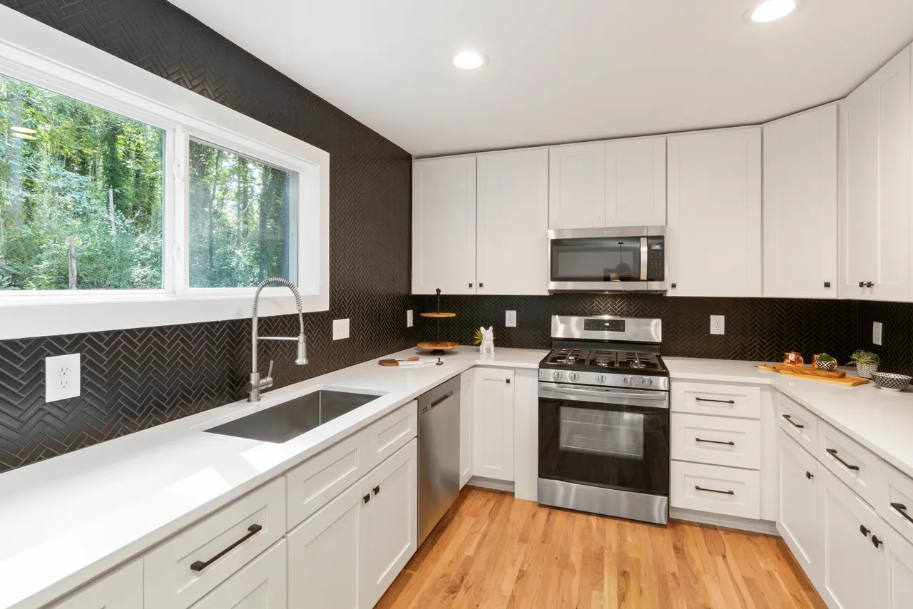
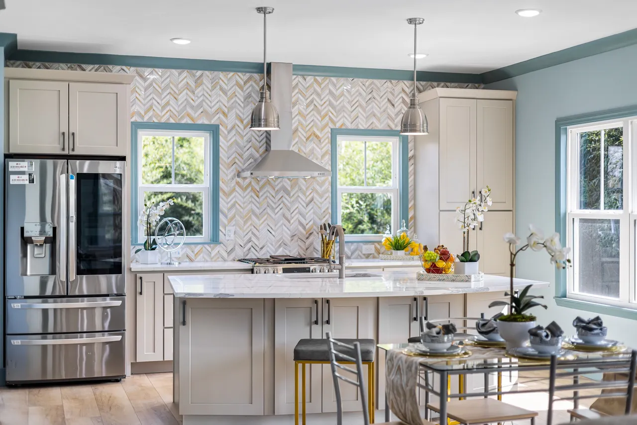
Colors have a profound impact on our emotions and can set the tone for your kitchen. Warm colors like red, orange, and yellow stimulate appetite and create a cozy, inviting atmosphere, making them ideal for kitchens where families gather. On the other hand, cool colors like blues and greens promote calmness and relaxation, perfect for creating a serene cooking environment. By understanding the psychology of colors, you can design a kitchen that not only looks great but also feels right.
2. Reflecting Your Personal Style
Your kitchen is a reflection of your personality, and color is one of the best ways to express your unique style. Whether you prefer a sleek, modern look with monochromatic tones or a bold, eclectic design with vibrant hues, the right color palette can bring your vision to life. Don’t be afraid to experiment with colors that resonate with you—your kitchen should feel like an extension of your home and lifestyle.
3. Enhancing Functionality with Strategic Color Choices
Color isn’t just about aesthetics; it can also improve the functionality of your kitchen. For example, using contrasting colors on your kitchen island can draw attention to the central workspace, while lighter shades on walls and backsplashes can make a small kitchen feel more spacious. By strategically incorporating color, you can create a kitchen that’s both beautiful and practical.
4. Creating Visual Interest with Color Combinations
A well-thought-out color scheme can add depth and visual interest to your kitchen. Consider using complementary colors (opposite on the color wheel) for a dynamic look or analogous colors (adjacent on the color wheel) for a harmonious feel. These combinations can create a balanced and visually appealing design that stands the test of time.
Understanding the Psychology of Colors
Warm Colors: Energy and Appetite
Red: Stimulates energy and appetite, making it a great accent color for kitchens.
Orange: Promotes enthusiasm and creativity, ideal for social spaces.
Yellow: Evokes happiness and warmth, perfect for brightening up darker kitchens.
Cool Colors: Calm and Serenity
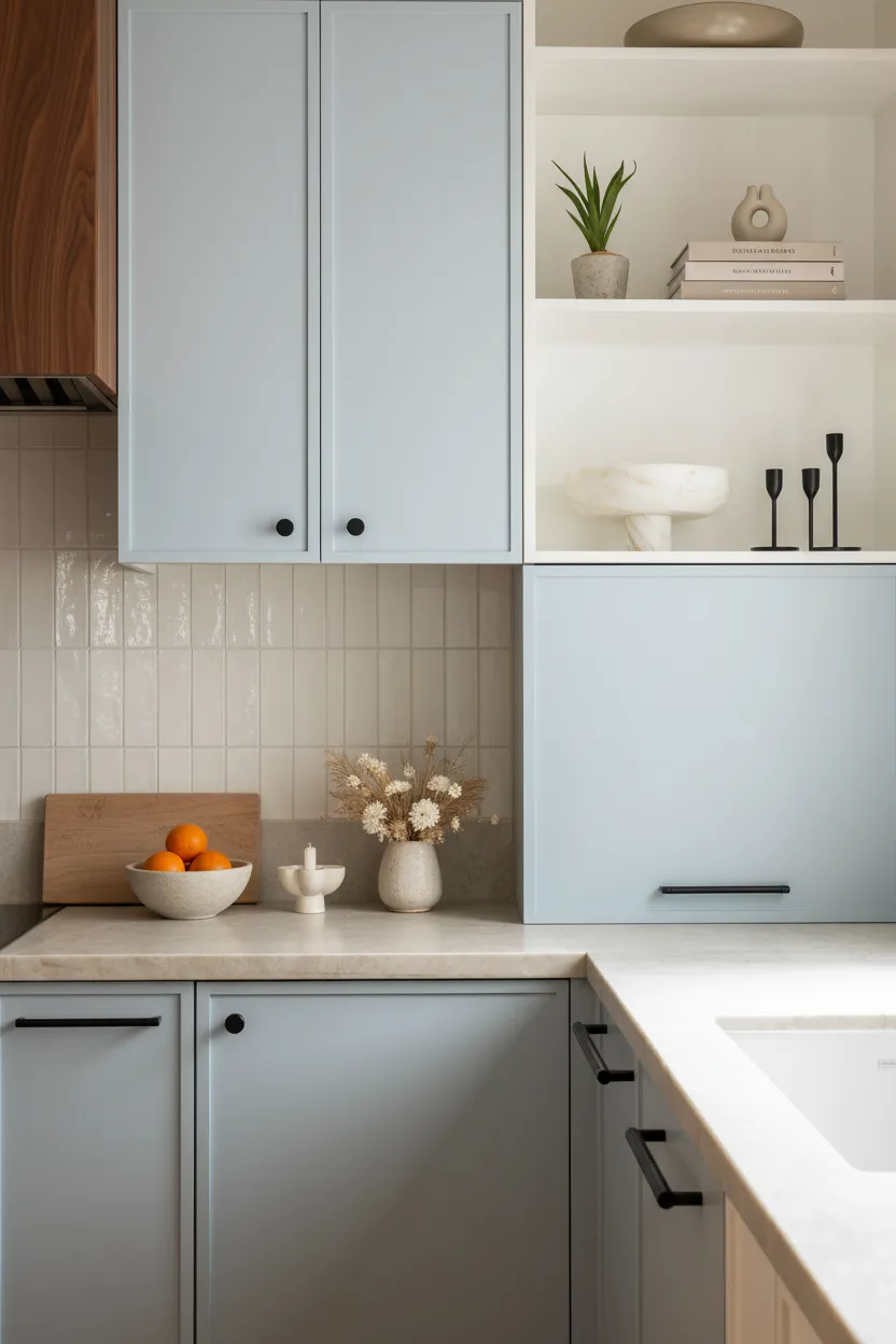
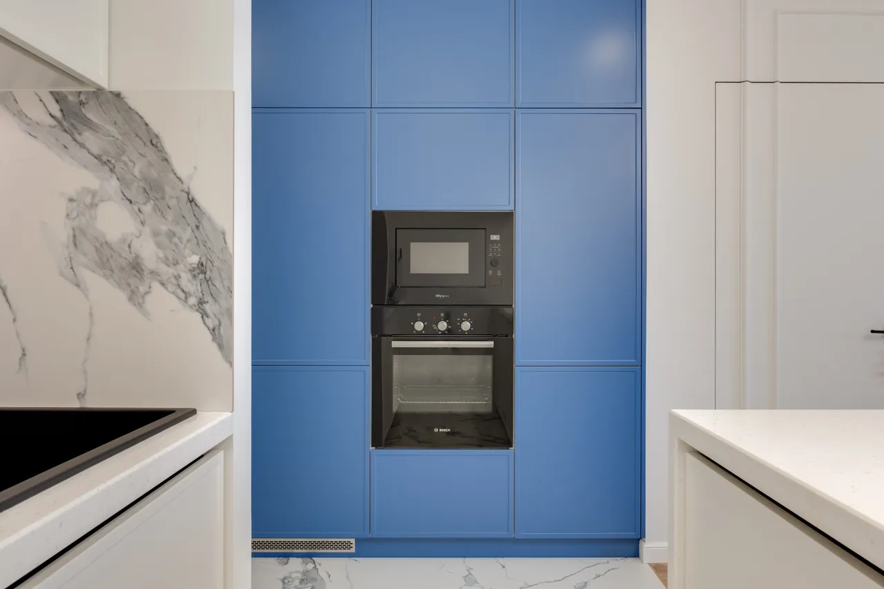
Blue: Creates a calming and soothing atmosphere, ideal for a tranquil kitchen.
Green: Symbolizes nature and harmony, making it a versatile choice for any kitchen style.
Neutral Colors: Timeless and Versatile
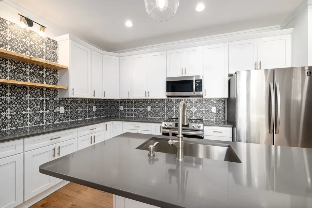
White: Represents cleanliness and simplicity, perfect for modern and minimalist designs.
Gray: Offers sophistication and elegance, working well as a neutral backdrop.
Beige: Provides warmth and comfort, ideal for traditional or rustic kitchens.
Accent Colors: Adding Personality
Accent colors like bold reds, greens, or blues can inject energy and personality into your kitchen. Use them sparingly to create focal points and visual interest.
How to Choose the Perfect Kitchen Color Palette
1. Harmonize with Existing Elements
Analyze Your Kitchen Layout: Consider the placement of windows, doors, and architectural features.
Evaluate Countertops and Cabinetry: Choose colors that complement your countertop materials and cabinet finishes.
2. Follow the 60-30-10 Rule
60% Dominant Color: Use this for walls or cabinetry.
30% Secondary Color: Apply this to countertops or backsplashes.
10% Accent Color: Add pops of color through accessories or decorative elements.
3. Test Colors in Your Space
Before finalizing your palette, test color swatches and samples in your kitchen to see how they interact with lighting and existing elements.
Popular Kitchen Color Trends
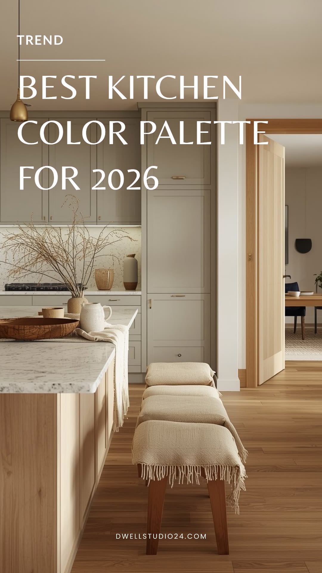
1. Neutral Tones for Timeless Appeal
Neutral colors like white, gray, and beige remain popular for their versatility and timelessness. They provide a clean backdrop that allows other elements to shine.
2. Bold Accent Colors for Modern Kitchens
Incorporate bold accent colors like navy blue, emerald green, or mustard yellow for a contemporary touch.
3. Monochromatic and Contrasting Schemes
Monochromatic schemes create a sophisticated look, while contrasting schemes add vibrancy and energy to your kitchen.
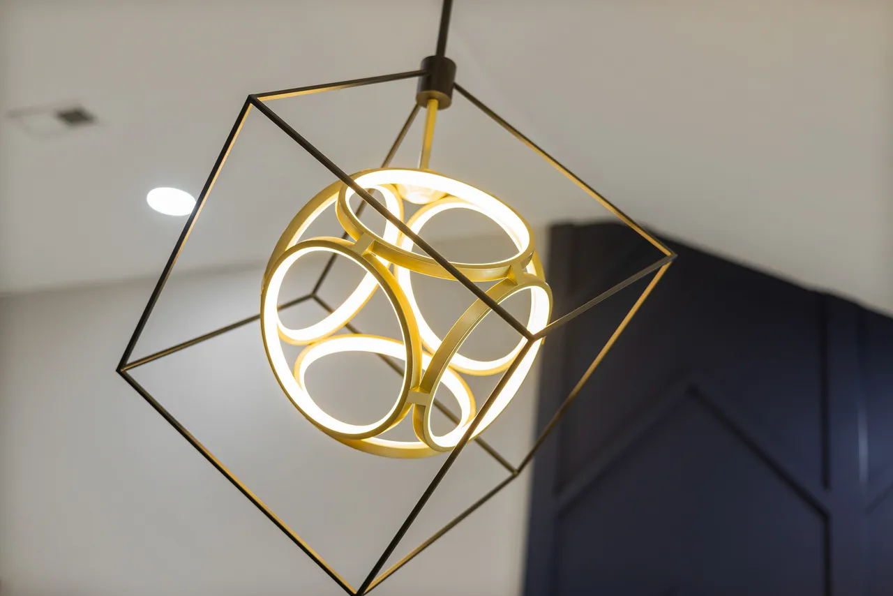
Lighting: The Secret to Showcasing Your Colors
Proper lighting is essential for highlighting your kitchen’s color palette. Use a mix of ambient, task, and accent lighting to enhance colors and create the desired ambiance. Consider the color temperature of your lights—warm white for cozy spaces and cool white for a modern, crisp look.
Final Thoughts: Transform Your Kitchen with Color
The importance of color in kitchen design cannot be overstated. From setting the mood to enhancing functionality, the right color palette can transform your kitchen into a space that’s both beautiful and practical. Ready to start your kitchen renovation? Book a free consultation with our team to get expert advice on layout, appliances, and color selection. Let’s create a kitchen you’ll love for years to come!